The Stockholm Furniture Fair 2025 offered a glimpse into the future of furniture design, with the highlight undeniably being its bold theme: Materials of the Future. As we roamed through the event, it became immediately clear that local designers are blending traditional craftsmanship with cutting-edge materials and innovative technologies to address pressing ecological and social challenges.
Each year, Clerkenwell Design Week (CDW) serves as a hub of creativity and inspiration for design enthusiasts worldwide, and it’s a great opportunity for us to find the latest trends shaping the future of workspace design.
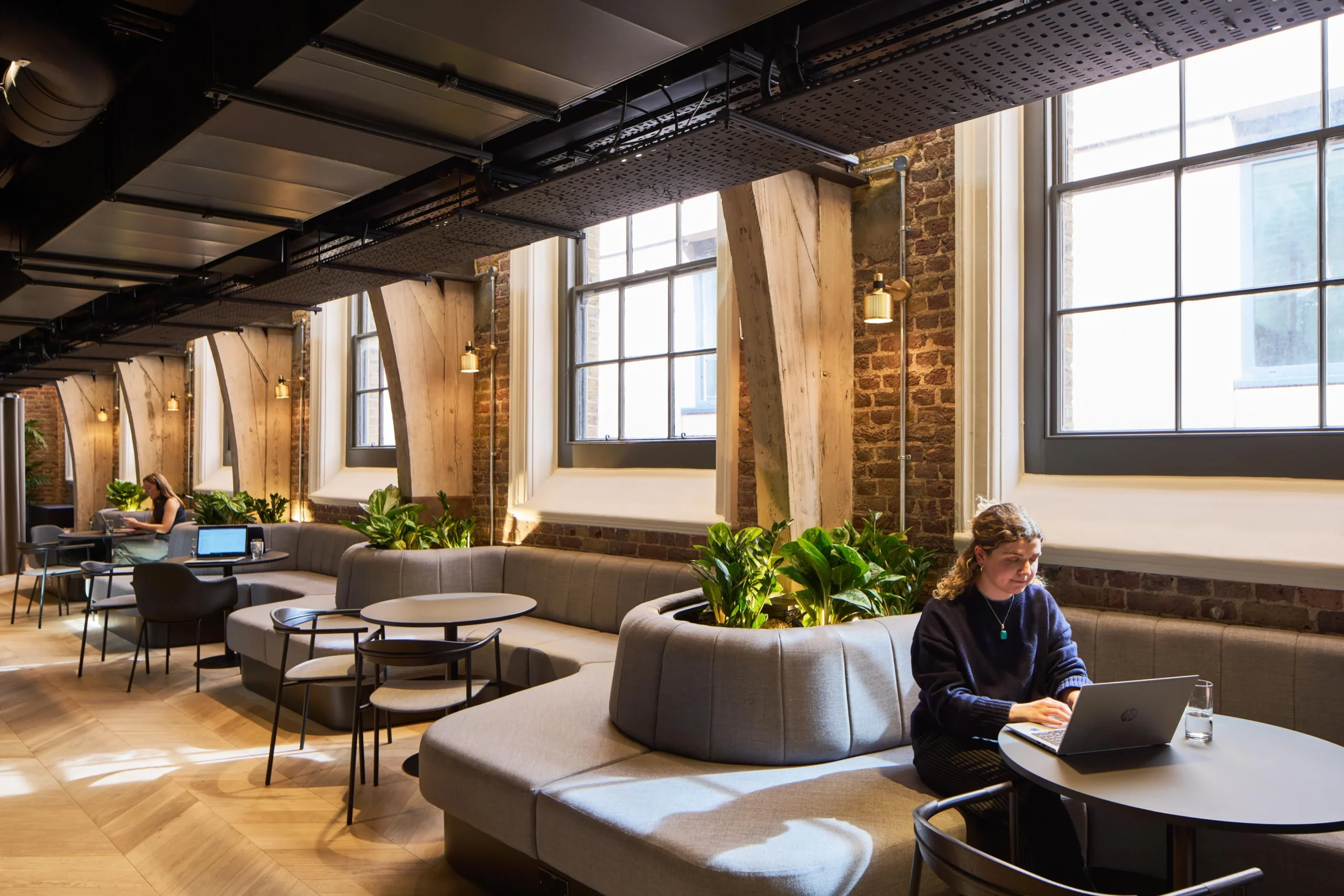
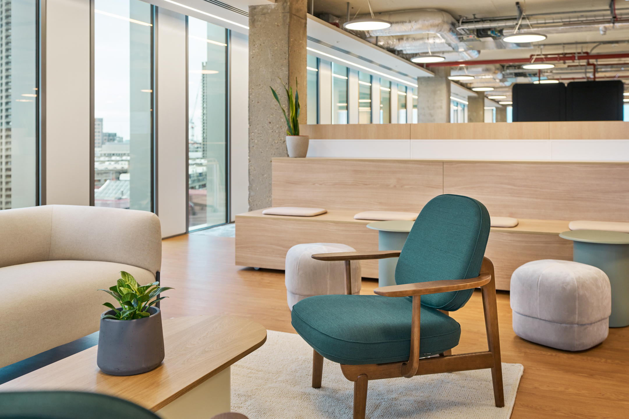
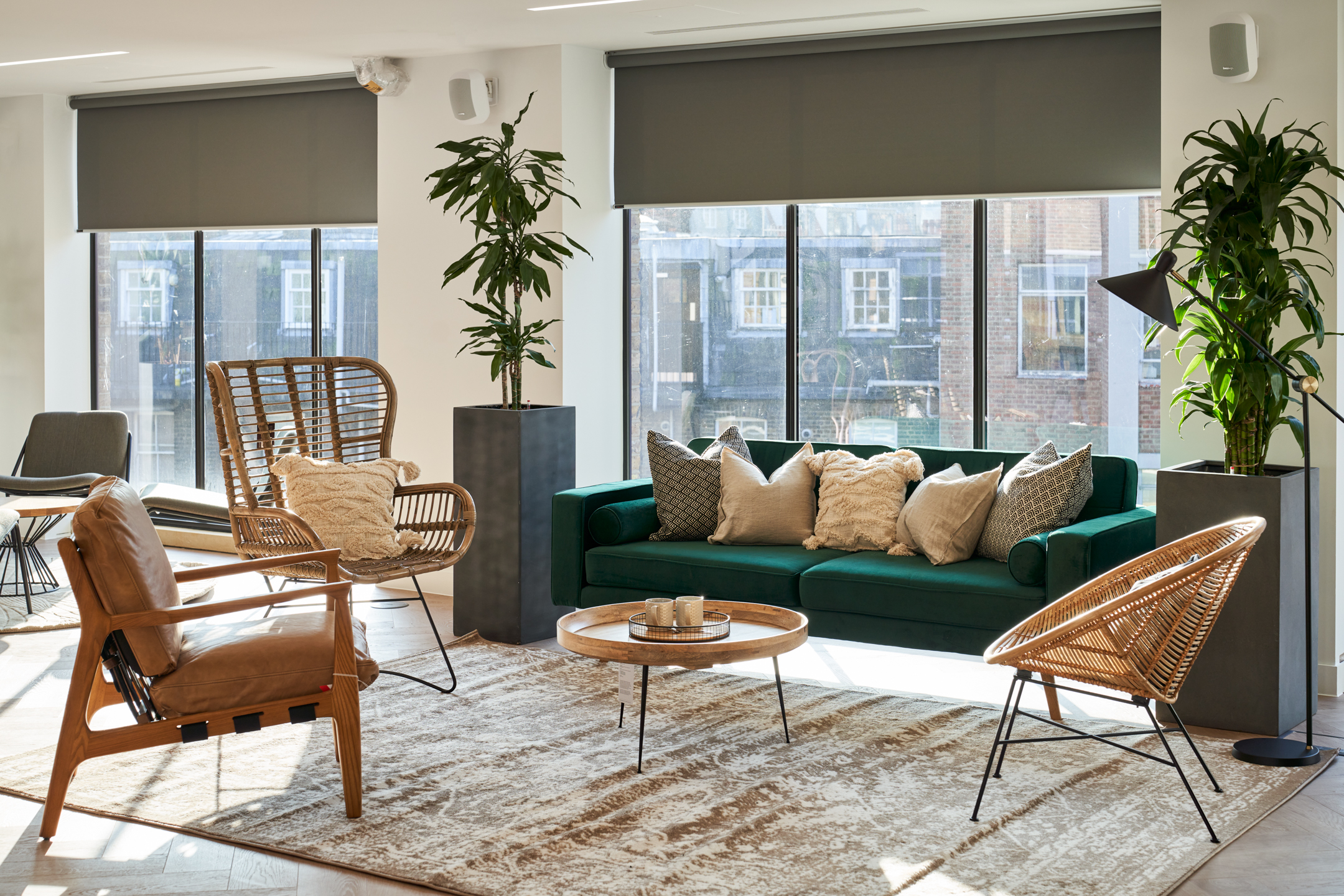
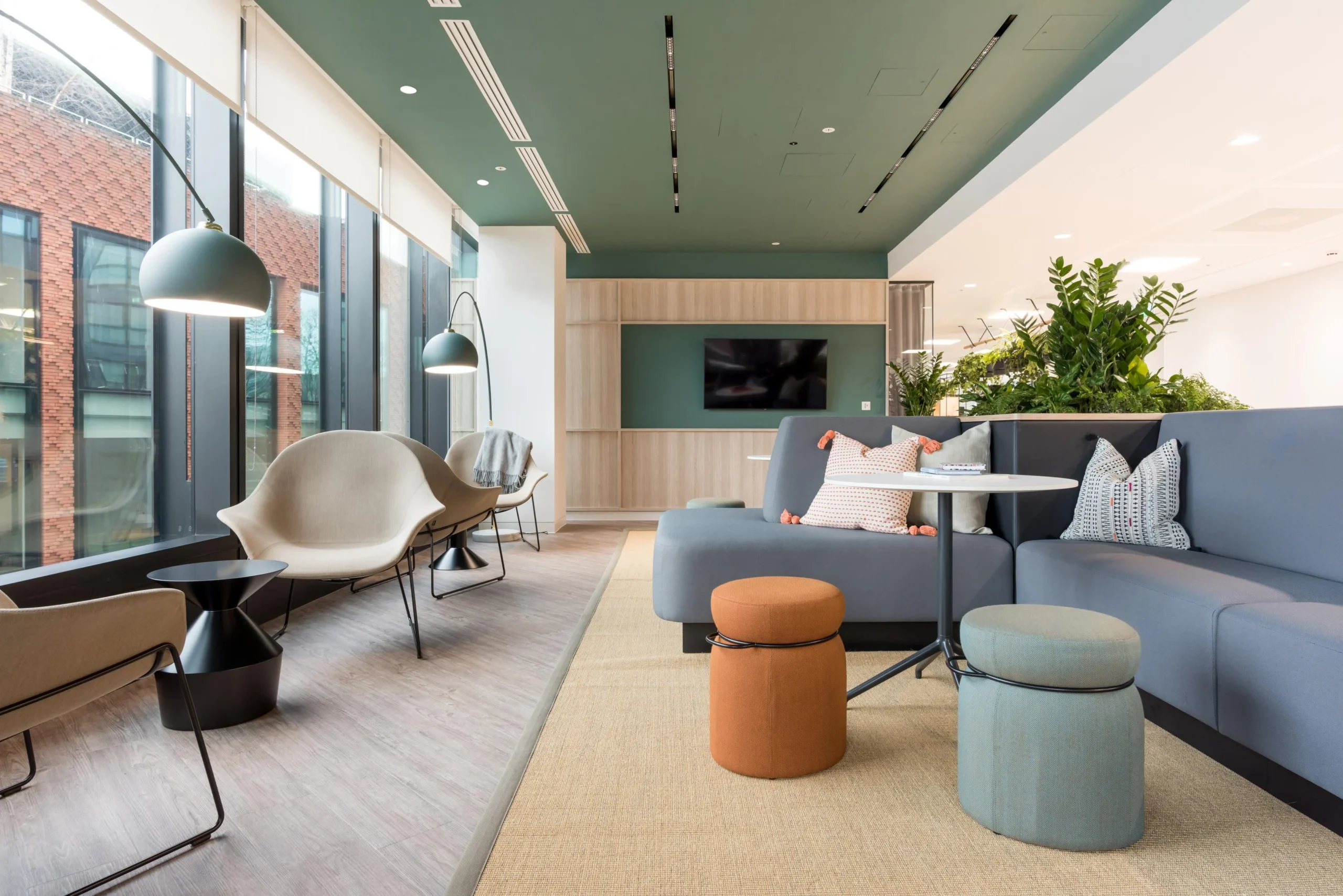
Meet Adyen, the new ambitious young financial technology platform helping the world’s leading businesses achieve their goals. After quick growth, a London Headquarters to call home was on the cards. We had the pleasure of working alongside Modus Workspace and Adyen to curate an exceptional working environment for their Soho based space.
We are so proud to announce that on Friday, 20th May, our client Alchemy won the Refurbished and Recycled Workplace category in the Midlands & Central England region at the BCO awards 2022.
We are super excited for Clerkenwell Design Week this year and hope to get to as many shows as possible! As well as showroom events you will be able to uncover immersive installations which can be found dotted along the exhibition route and beyond. We have gathered a ‘must see’ list of brands attending CDW.
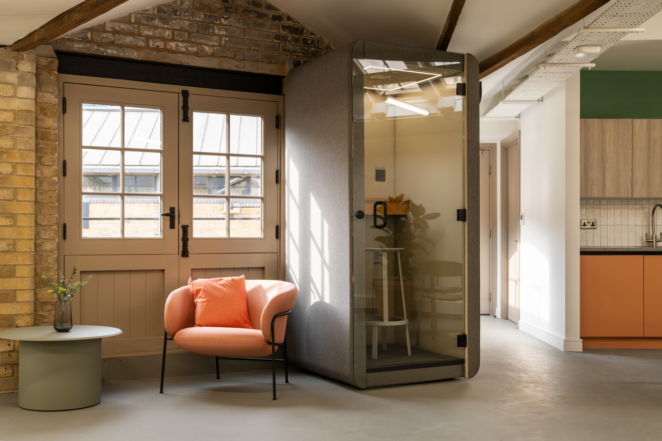
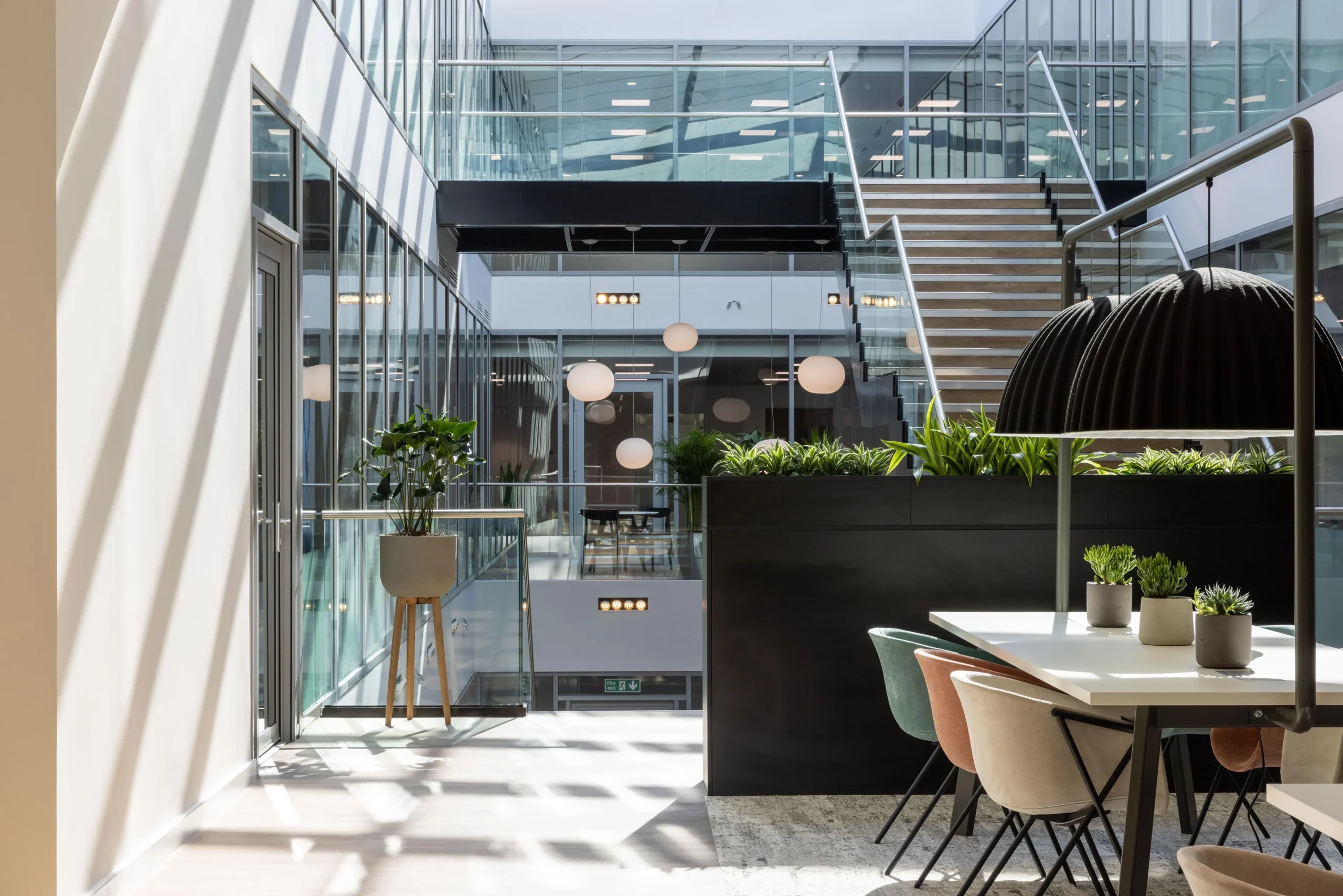
Sustainability and innovation are at the forefront of everything that we do, so when we heard the news that Frovi had just launched their Bamboo Shelving Unit, we knew it would be the perfect addition to Buckingham Green, the ultimate mix of sustainability, innovation and luxury. We got inventive to create a future-proofed, Tenant-Ready™ space for London & Oriental like no other.
We are over the moon to learn that Workplace Futures Group has been featured in The Sunday Times Fast Track PwC Top Track 250 organisations. This ranking the UK’s leading mid-market private companies with the biggest sales and performance for 2020.
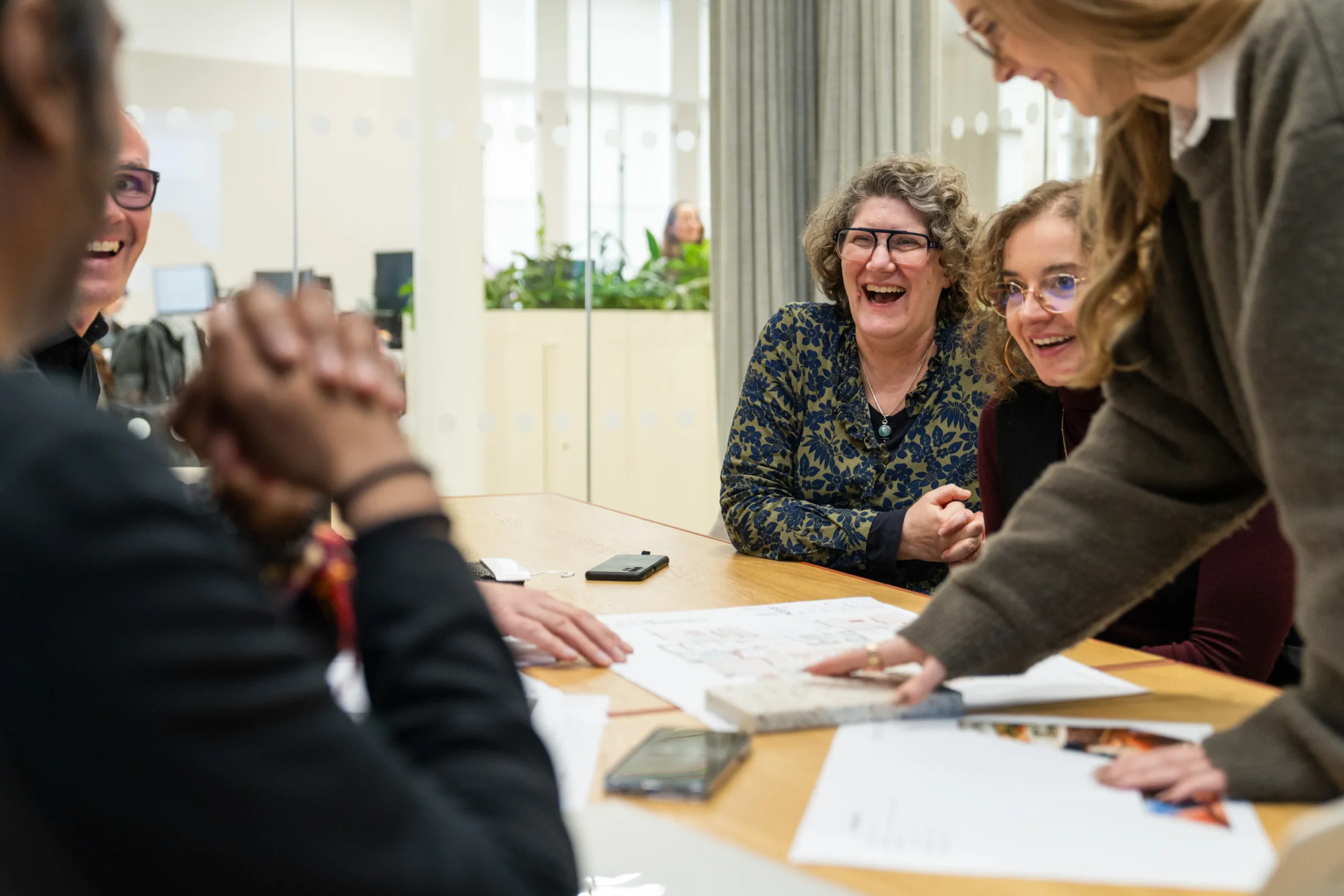
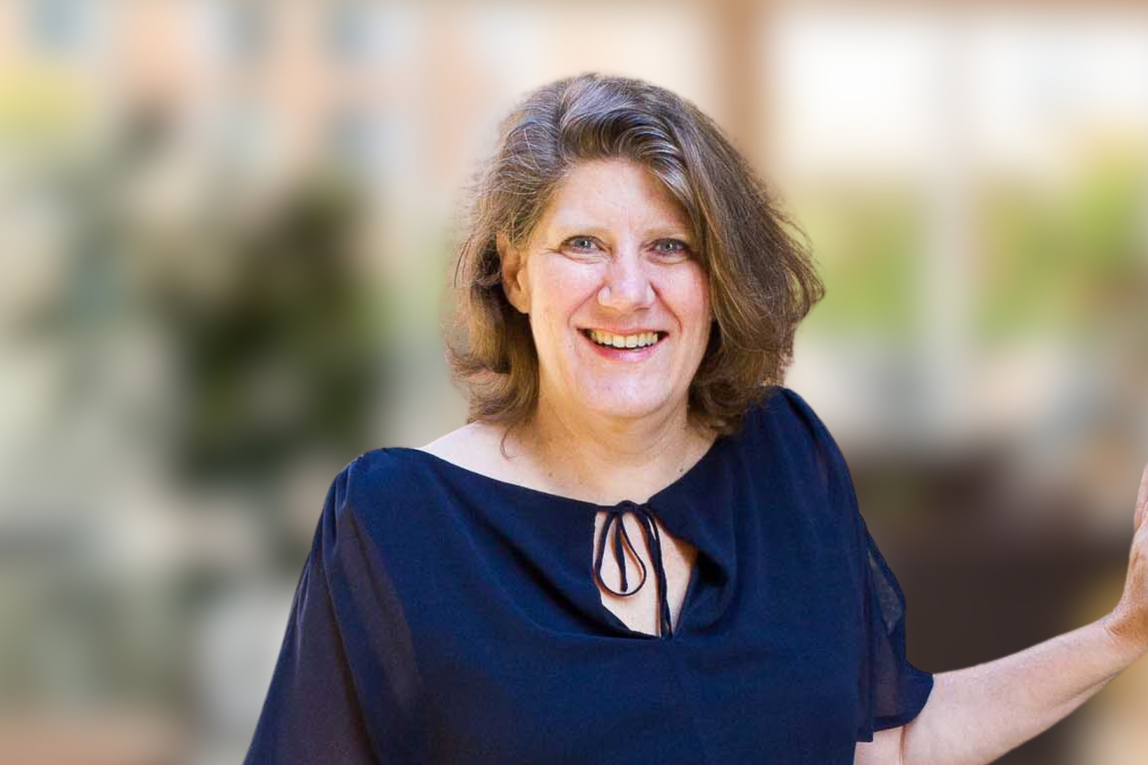
We have news. After over 10 years working at Workplace Futures Group furniture division (before it became Platfform!) we are so pleased to say that Carol Deruy has been promoted to Director of Platfform. We sat down with her over a virtual coffee to find out what she has in store for Platfform in her new exciting role moving forward.